Unveiling Housing Prices with Neural Networks
In this project, I analyzed a dataset containing housing records to build a predictive model for housing prices. My journey involved exploring various features, handling data preprocessing, and finally deploying a neural network model to make accurate predictions.
Dataset used: https://lnkd.in/gJdvGpk7
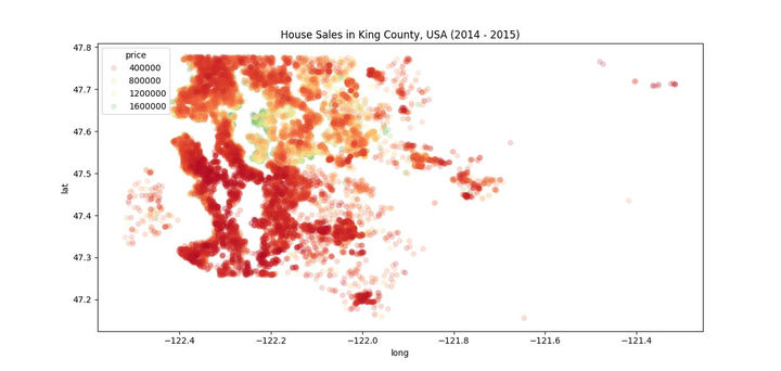
In this visual, we have a geospatial heat map of House Sales in King County, USA (2014-2015), where the color gradient represents the price range of the homes sold.
Western and Central King County shows a concentration of high-priced homes (depicted in dark red). This could indicate more affluent areas, likely urban or suburban zones with desirable locations, amenities, and proximity to cities like Seattle.
Eastern King County seems to have a mix of mid to high-priced homes, with lighter red to orange regions. This could reflect growing suburban developments, or areas where land is still being developed, resulting in a range of property prices.
Southern and Southeastern King County shows mostly lower-priced homes (pink to light orange), possibly indicating rural or less developed regions where property values are lower.
Houses closer to the west side of King County (likely near Seattle, based on the coordinates) tend to be more expensive. As we move eastward (past longitude -122), house prices generally decrease, possibly indicating a shift from urban to suburban and rural areas. Similarly, homes in the northern part of the county (closer to latitude 47.7) are generally higher priced than homes in the southern regions.
This map gives a clear visual of how housing prices in King County are heavily dependent on location. Higher prices tend to be concentrated in the urban centers (likely Seattle and nearby areas), while the more rural outskirts have lower prices. The diverse range of pricing highlights the economic disparities within the county, with certain pockets driving up the average housing prices.
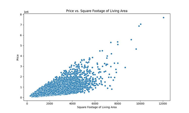
This scatter plot visualizes the relationship between Price (on the y-axis) and Square Footage of Living Area (on the x-axis) for homes in King County.
There is a positive correlation between the square footage of living area and the price of homes. As the size of the living area increases, the price also tends to rise, suggesting that larger homes are generally more expensive.
The majority of the data points are clustered in the lower range of both price and square footage. Most homes fall within the 0 to 4000 square feet range for living area and under $2 million in price.
The density of points is highest between 1000 and 3000 square feet, with prices ranging from $200,000 to $1 million. This suggests that most homes in the dataset are within this range of size and price. The spread becomes wider as the square footage increases. For homes larger than 4000 square feet, prices are more spread out, indicating that factors other than just size (like location, amenities, etc.) might contribute to the price variability.
There are a few outliers visible in the graph, especially for larger homes above 8000 square feet, where prices exceed $4 million, with one home priced at around $7 million.
The plot confirms that larger homes typically command higher prices, but the relationship is not strictly linear; at larger square footage levels, there is more variability in price. This suggests other features may play a more significant role in determining the price for bigger homes. This type of graph would be useful for real estate pricing models to predict home values based on living area, and it shows the diminishing returns in price per additional square footage for very large homes.

This heatmap visualizes Monthly Average Housing Prices over two years, 2013 and 2014. Here's the breakdown of the graph and key points to interpret:
The color scale represents the Average Price of houses, with a range from $300,000 to $560,000. There is a clear increase in average housing prices from 2013 to 2014. For instance, in January 2013, the average price was around $352,871, while in January 2014, it rose to $547,100. Similar trends can be seen throughout the months, indicating an overall upward trend in housing prices over the two years.
In 2013, prices were relatively lower in the early months, with prices reaching the lowest in May 2013 (approximately $361,880). Prices in 2014 remain relatively stable, with slight fluctuations across the months. The prices appear more consistent after May 2014, stabilizing between $519,000 and $544,000. Notably, August 2014 saw the highest average price at $544,725.
The colors get progressively lighter as you move from 2013 to 2014, especially after May, which shows the rising trend in housing prices. 2014 consistently shows lighter colors compared to 2013, further highlighting the general price increase. There seems to be a dip in prices during the mid-year months in both 2013 and 2014 (around May and June), possibly indicating a seasonal factor influencing housing prices.
The graph indicates a steady growth in housing prices over the years, suggesting that 2014 was a more expensive year for home buyers. There could be seasonal factors affecting the mid-year price drops, which could be a useful insight for real estate strategies. 2014 shows more price stability throughout the year, compared to the fluctuating pattern seen in 2013, which could be an indication of a maturing market or economic conditions favoring consistent pricing. This graph is a useful representation for tracking how average housing prices evolved over time and understanding both year-to-year growth and seasonal pricing trends.
Neural Networks


The residuals plot represents the distribution of errors between the predicted and actual house prices. The residuals are concentrated around 0, indicating that most predictions are fairly accurate. A narrow distribution like this typically signifies that the model performs consistently, with fewer large errors.
This scatter plot compares the predicted prices (Y-axis) against the actual test data prices (X-axis). The red diagonal line represents a perfect match between the predicted and actual prices. Data points close to the line indicate accurate predictions, while points farther from the line suggest larger deviations. This chart demonstrates the neural network's ability to predict house prices reasonably well, though there are some noticeable outliers.

Summary and Evaluation
This project offered valuable insights into the housing pricing strategies implemented during 2013-2014 and their evolution over the months. It effectively analyzed the relationship between a house's square footage and its price, providing a deeper understanding of the key factors influencing pricing trends over time. Additionally, I utilized geospatial data to visualize the distribution of home prices within a given community, highlighting the significant role that location plays in determining housing prices.
Moreover, during this time I got the opportunity to implement a neural network to help me predicted the pricing of homes in the future. I developed a neural network model to predict housing prices based on various features such as square footage, number of rooms, location, and more. The neural network provided a strong fit for the data, effectively capturing non-linear relationships between the features and housing prices. After tuning the model's hyperparameters and performing cross-validation, the model achieved a good level of accuracy, outperforming traditional regression models.
While the model performs well, it's important to note that real-world factors like market trends, economic shifts, and sudden changes in demand may affect predictions beyond the model's training scope. Further improvements could include incorporating additional data points, such as neighborhood amenities and proximity to key services, to refine the predictions.